
최상위 함수 호출
// 앱의 시작점
// runApp(): 플러터의 최상위 함수로, 처음에 한번만 호출됨. 반드시 widget을 불러와야 함.
// runApp()이 호출될 때 구체적으로 가지는 값인 Widget을 Argument라고 부름.
// MyExercise() Widget: Custom Widget
void main() => runApp(MyExercise());

// MyExercise Widget: 최상위 위젯으로, 앱의 뼈대가 될 위젯이기 때문에
// 움직임이 없는 정적인 Stateless Widget으로 구성해야 함.
class MyExercise extends StatelessWidget {
  const MyExercise({Key? key}) : super(key: key);

  @override
  Widget build(BuildContext context) {
    // 현재 필요한 것은 Material library 기능을 사용할 수 있는 위젯
    // MaterialApp
    return MaterialApp(
      title: 'Character Card',
      home: MyCard(), // Custom Widget
    );
  }
}
최상위 위젯인 MyExercise Widget을 runApp() 함수를 통해서 불러옴.
최상위 위젯은 앱의 뼈대가 될 위젯이므로, Stateless Widget으로 구성해준다.
최상위 위젯에서 MaterialApp Widget을 불러오고, home으로 MyCard라는 Custom Widget을 구성해준다. (이름은 맘대로)
캐릭터 카드를 보여주는 MyCard Widget
// custom widget 을 만들때에는 항상 먼저 Stateless, Stateful 로 해야할지 고민해야함.
class MyCard extends StatelessWidget {
  const MyCard({Key? key}) : super(key: key);

  @override
  Widget build(BuildContext context) {
    // 앱을 디자인하기 위해서 Scaffold() Widget 불러옴
    return Scaffold(
      backgroundColor: Colors.amber[800],
      appBar: AppBar(
        title: Text('BBANTO'),
        centerTitle: true,
        backgroundColor: Colors.amber[700],
        elevation: 0.0,
      ),
BBANTO라는 캐릭터 카드를 디자인 하기 위함.
centerTitle: AppBar의 제목을 가운데 정렬해준다.
elevation: Default로 AppBar는 조금 떠있는데 그 정도를 조절해주는 속성.
MyCard Widget에서 중요한 부분의 코드만 살펴보자.
body: Padding(
        padding: EdgeInsets.fromLTRB(30, 40, 0, 0),
        child: Column(
          // 앱스크린 내에서 세로축으로 정렬할 때 쓰이는 속성
          // MainAxisAlignment.center: 세로축에서 중앙 정렬
          // mainAxisAlignment: MainAxisAlignment.center,
          // 가로축 특정 위치로 정렬할 때 쓰이는 속성
          crossAxisAlignment: CrossAxisAlignment.start,
          children: [
            Center(
              child: CircleAvatar(
                backgroundImage: AssetImage('assets/robot.gif'),
                backgroundColor: Colors.amber[800],
                radius: 60,
              ),
            ),
            Divider(
              // Divider 위 아래 높이가 앞쳐서 60이라는 의미임
              // 즉, Divider 기준으로 위로 30, 아래로 30 이라는 의미.
              height: 60,
              color: Colors.grey[850],
              thickness: 0.5,
              endIndent: 30,
            ),
            Text(
              "NAME",
              // cmd 를 누른 채로 TextStyle을 누르면 사용할 수 있는 속성들을 볼 수 있음.
              style: TextStyle(
                color: Colors.white,
                // 철자 간의 간격
                letterSpacing: 2.0,
              ),
            ),
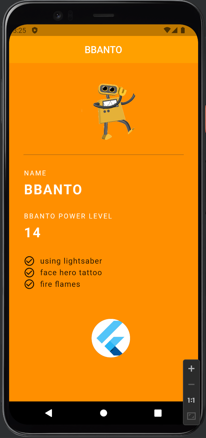
위 코드처럼 작성하게 되면 오른편 캡쳐사진 처럼 핸드폰 화면에
나타나게 된다. Divider가 존재하지 않으면 Text와 CircleAvatar가 완전히 붙어버려 보기 좋지 않으므로, Divider를 통해서 구분해준
모습이다. Divider는 작성하면 저렇게 줄로 표시되는 반면, SizedBox는 보이지 않고, 공간만 차지하기 때문에 그 점에서 두 위젯은 차이가 있는 것 같다. 그러나 쓰이는 용도는 비슷하다.
assets 폴더에서 이미지 파일 등을 불러오는 방법
위 코드를 보면 위젯에서 robot.gif 파일을 불러오는 것을 볼 수 있는데 위젯에서 파일을 불러오기 위해서는 pubspec.yaml 파일에서의 사전 작업이 필요하다.
# The following section is specific to Flutter packages.
flutter:

  # The following line ensures that the Material Icons font is
  # included with your application, so that you can use the icons in
  # the material Icons class.
  uses-material-design: true

  # To add assets to your application, add an assets section, like this:
  assets:
   - assets/robot.gif
   - assets/flutter.jpg

  # An image asset can refer to one or more resolution-specific "variants", see
  # https://flutter.dev/assets-and-images/#resolution-aware

  # For details regarding adding assets from package dependencies, see
  # https://flutter.dev/assets-and-images/#from-packages
위의 코드들은 pubspec.yaml 파일의 일부분이다. 처음 flutter project를 만들게 되면, 초기에 assets: 부분은 주석처리 된 상태로 만들어지게 되는데, assets 폴더를 만들어서 사용해주기 위해서는 그 부분을 주석해제 해주어야 한다.
이 때 주의할 점은, 스페이스바 하나 하나에 yaml 파일은 예민하게 반응하기 때문에 주석 해제 해주었는데도 에러가 뜬다면 그 부분을 확인해주어야 한다.
결과적으로 아래 그림처럼 결과물을 만들어낼 수 있다.
참고
코딩셰프 유튜브 채널: https://youtu.be/qnnExhBcNTk
'🐦 플러터' 카테고리의 다른 글
| [Flutter] BuildContext + Snack Bar 이해하기 (0) | 2022.12.24 |
|---|---|
| [Flutter] 플러터 AppBar 아이콘 추가하기 (0) | 2022.12.23 |
| [Flutter] 플러터 프로젝트 구성 이해하기 (1) | 2022.12.23 |
| [Flutter] 위젯이란 무엇인가 (0) | 2022.12.22 |
| [Dart] Factory Constructor (0) | 2022.08.04 |